Store optimization in 2019: AppStore Vs. Google Play
As you all know, App Store & Google Play are the two largest app stores means every developer who wants his app to live and monetize should pay attention to App Store Optimization (ASO). Right ASO strategy is extremely important and may boost an app straight to the top or either ruin it. So if you’re eager to increase organic downloads and hike your app’s search ranking you should take a closer look at Google Play and AppStore optimization specific aspects.
First of all, note that both Apple and Google release their operating system updates on a regular basis and every time that brings some changes to store as well.
Apple devices are now running iOS 12.1.4
The actual Android version is 9.0 Pie (version 10.0 is BETA now)
1. Icons
There are a few main guidelines to adjust application icon in AppStore & Google Play.
-
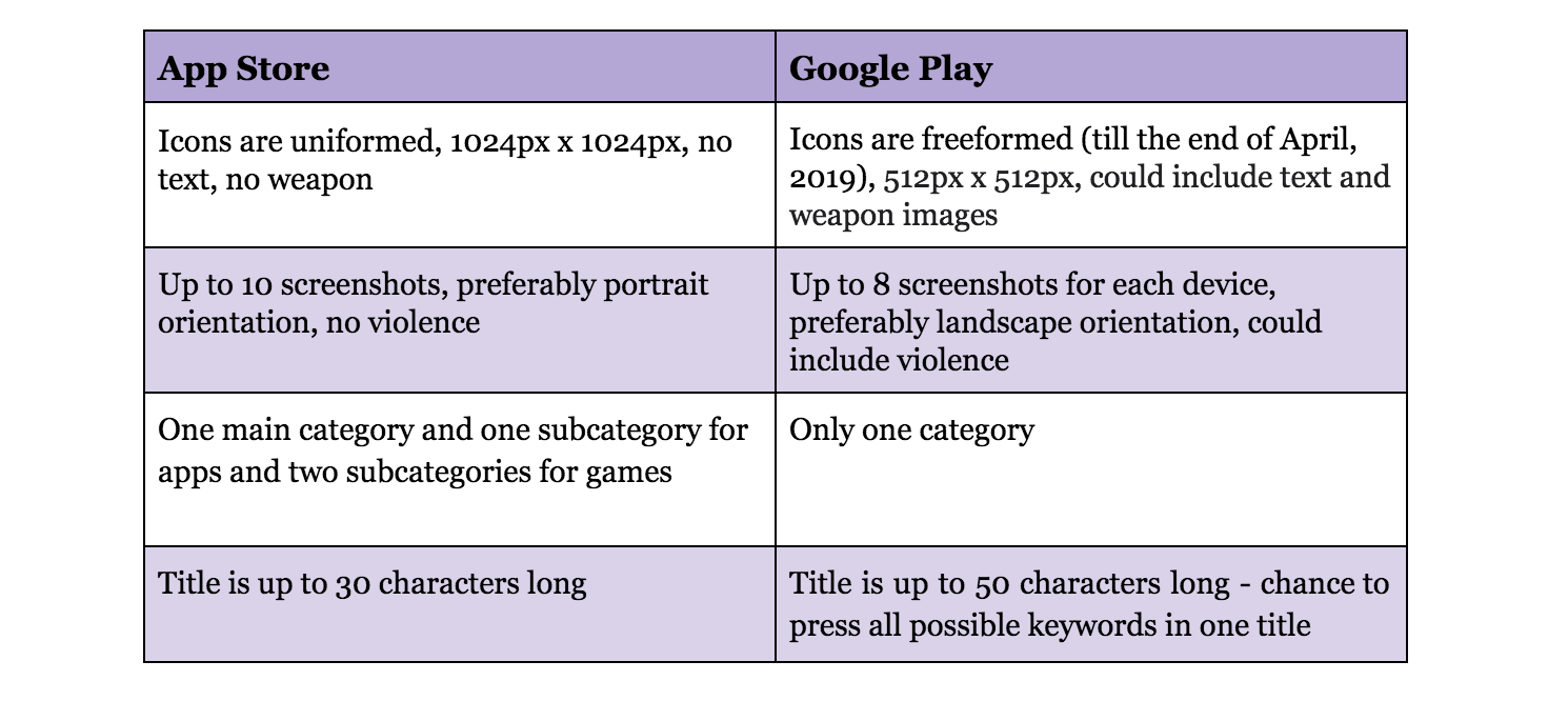
Size: Apple states icons in AppStore to be 1024x1024 px, it’s a bigger version of basic app icons 180x180 px. Google Play accepts Icon artwork of size 512x512 px
-
Form: iOS icons all have a united form of a rounded square (see as above) but Android app version could be more diverse.
The old icons format of Android apps allowed it to be freeform
Compare:
![]()
However, a while ago Android published a new icon design specifications proclaiming a “new icon system to better fit diverse developer artwork to Google Play's various UI layouts, form factors, and devices, as well as to bring consistency and a cleaner look to Google Play”. From now all icons would be uniformed.
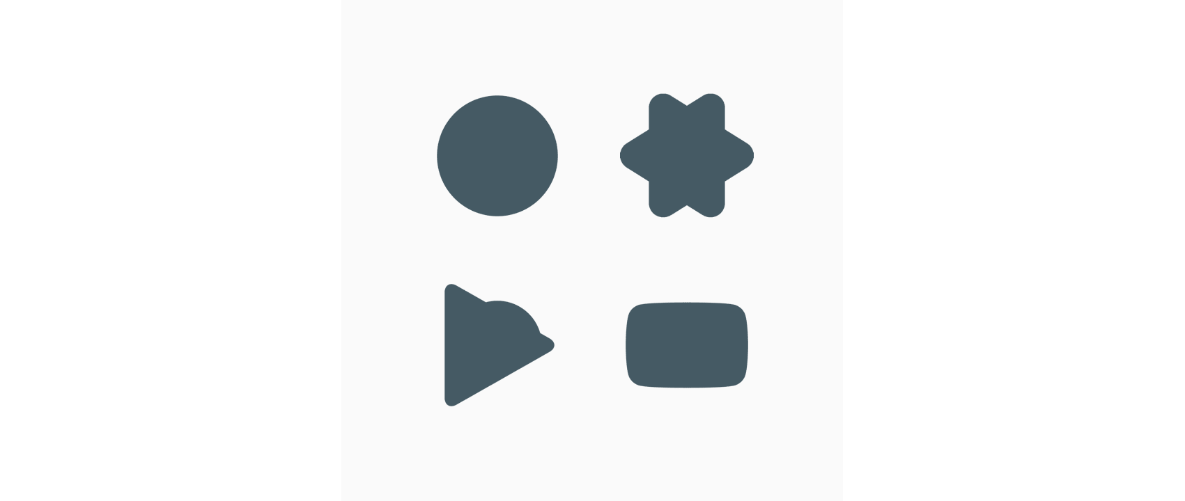
This rule kicks in soon. All developers should upload a new icon to Google Console by June 24.
- Content: as for the content of icons, App Store is more restricted as well. For example, Apple cautions developers against using words in their logos: An app’s name appears below its icon on the Home screen. Don’t include nonessential words that repeat the name or tell people what to do with your app, like "Watch" or "Play."
Compare:
![]()
Keep in mind that AppStore will not allow using weapons on icons. It affects shooting games the most: they should better keep icon with guns for Google Play.
Compare:
![]()
Sometimes application icons in AppStore & Google Play are slight different for no apparent reason:
![]()
...or be completely different
![]()
2. Screenshots
In Google Play you can add up to eight screenshots as opposed to ten screenshots in App Store. All screenshots should be adjusted to every type of device like a tablet, smartphone, watch etc. In both stores, developers can choose between portrait and landscape orientation. According to figures from Apptica Store Intelligence, iOS developers prefer using vertical screenshots while Google Play ones apply them both. Sometimes you can even see that one app’s screenshots are vertical in App Store and horizontal in Google Play.
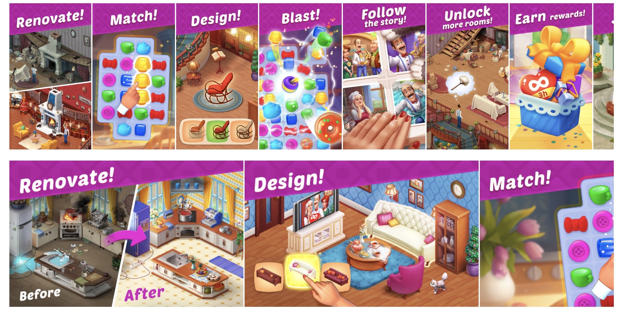
One of the ways to make your screenshots more catchy is to create a set of connected screenshots when each screenshot is the beginning of the next one. You can do it both for landscape and portrait screenshots.
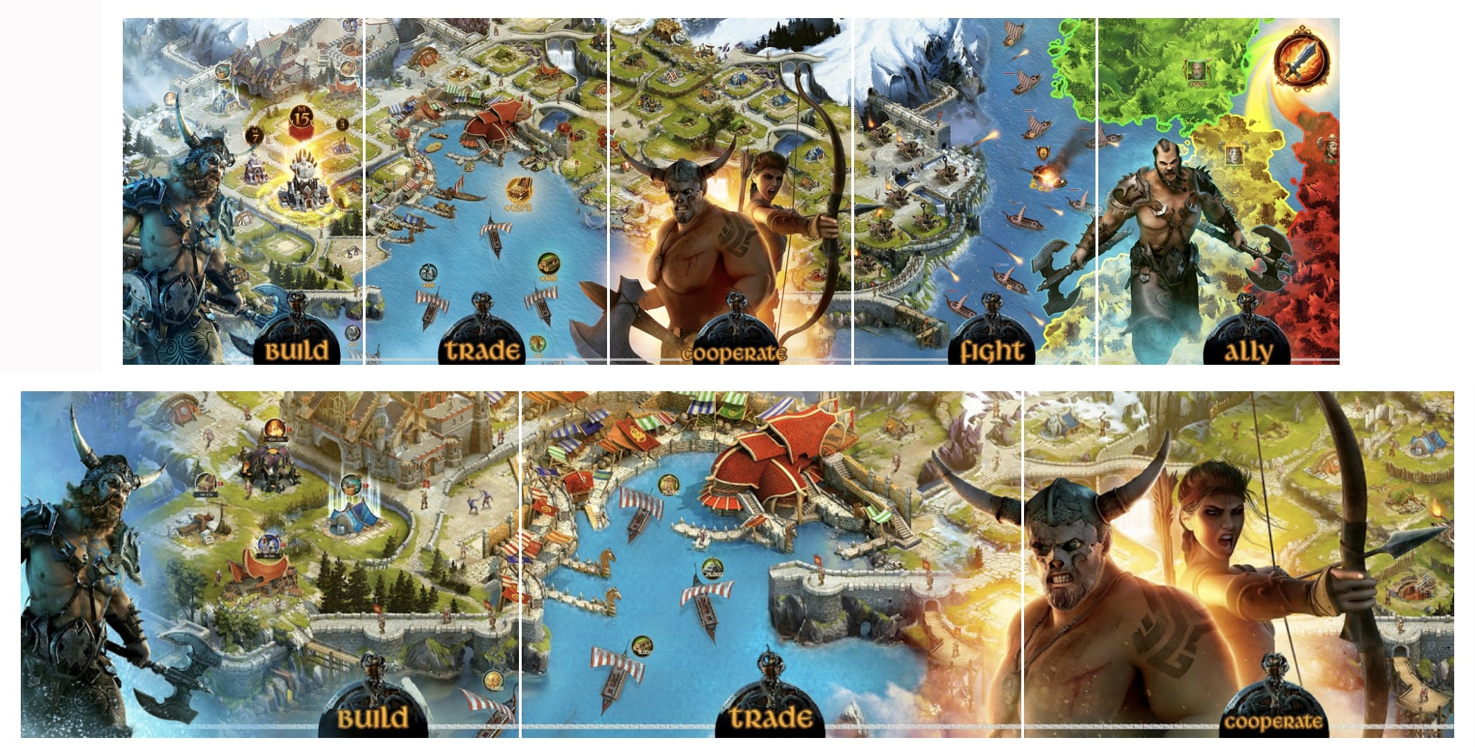
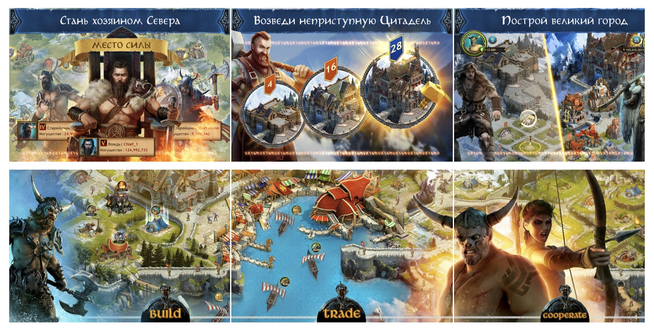
You can also localize your screenshots if needed in order to reach more target audience. Personalized approach is always better!
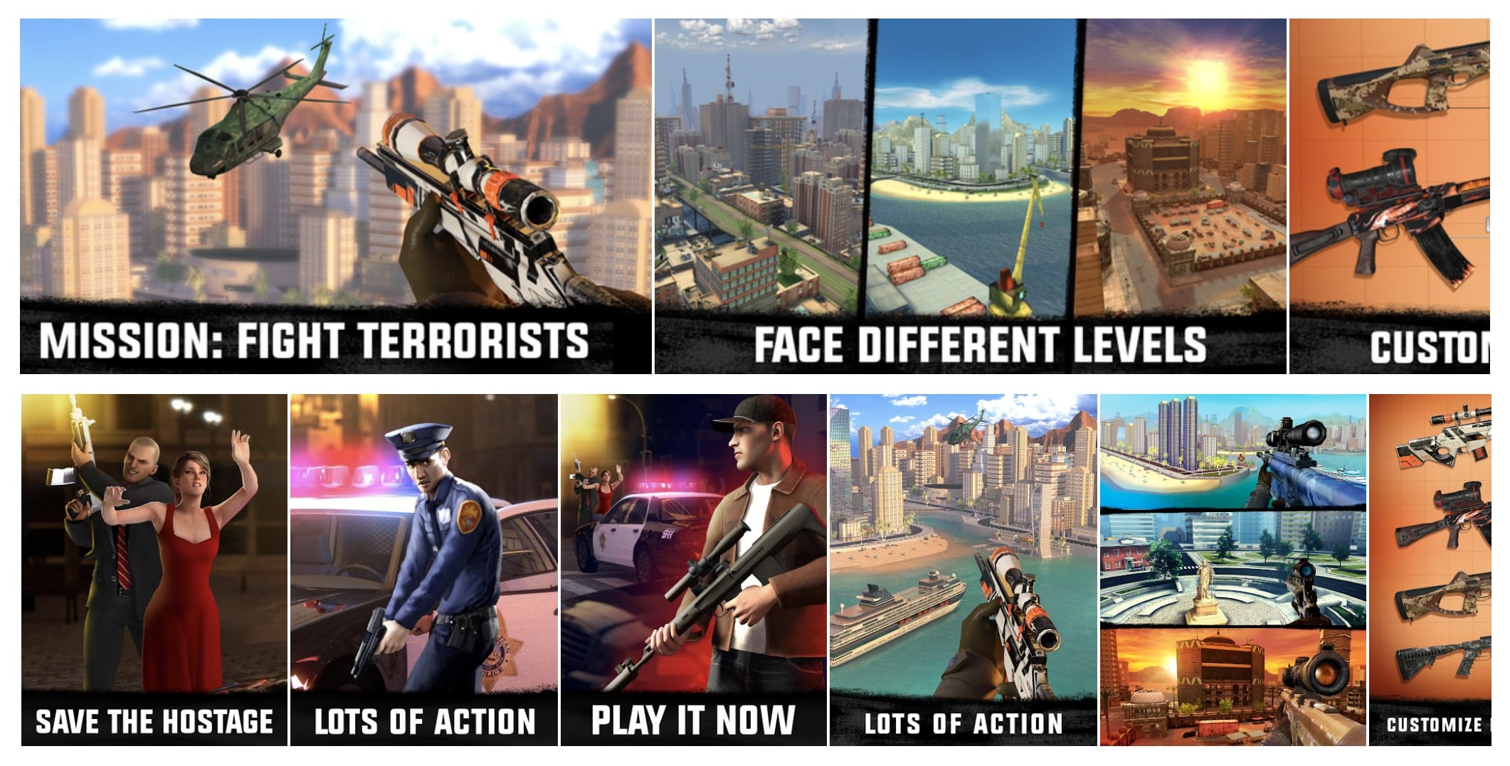
“No violence policy” of App Store works here too. For example, Top 10 Action application Sniper 3D Gun Shooter avoids people being victims or killers in their screenshots in App Store.
3. Category
A category is an aspect important for Top Charts ranking as the application will be shown in category charts. App Store allows one main category and one subcategory for apps and two subcategories for games.

4. App Title
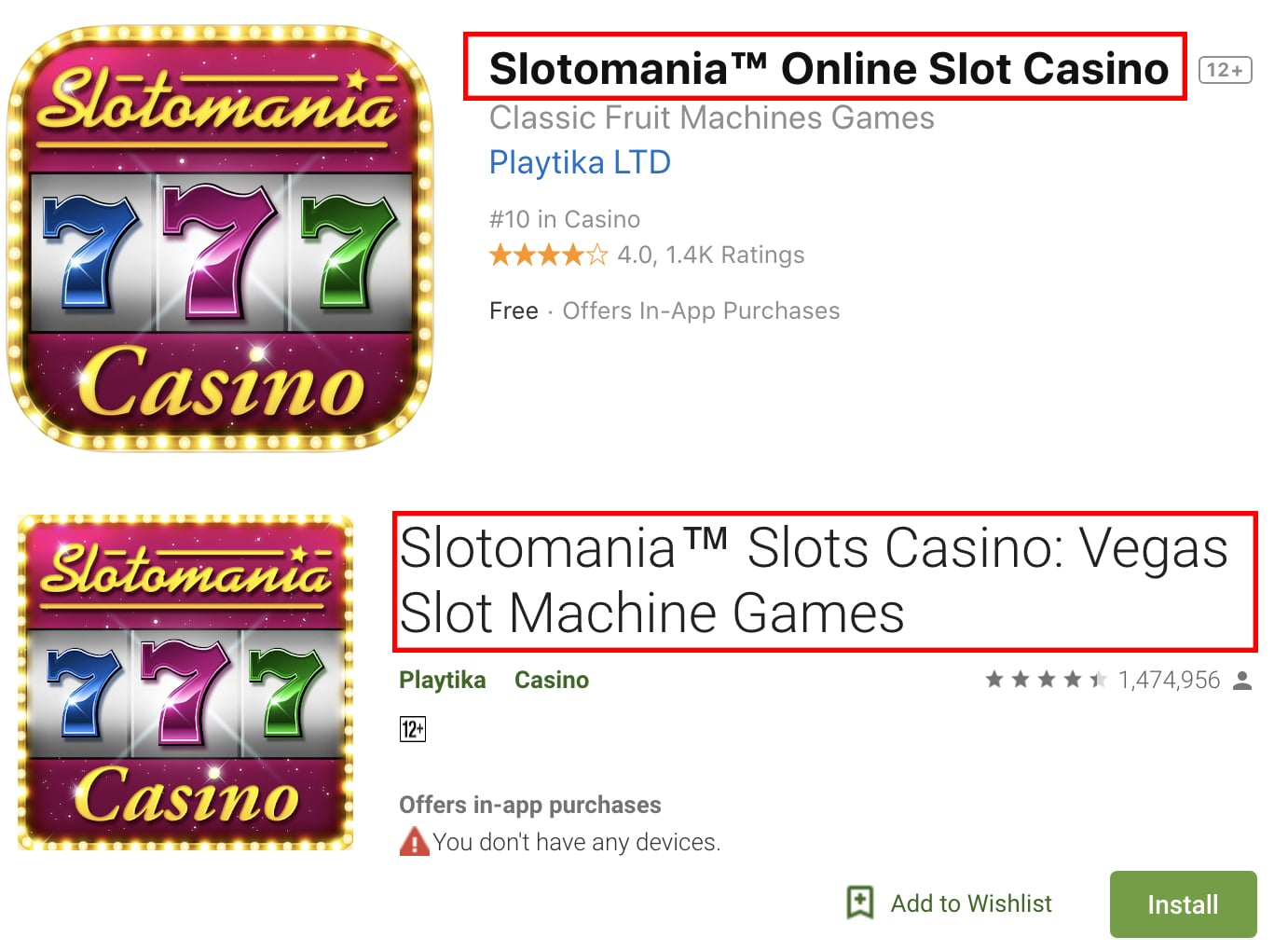
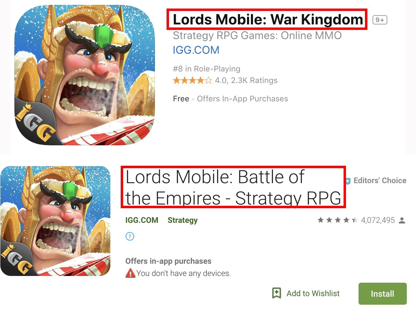
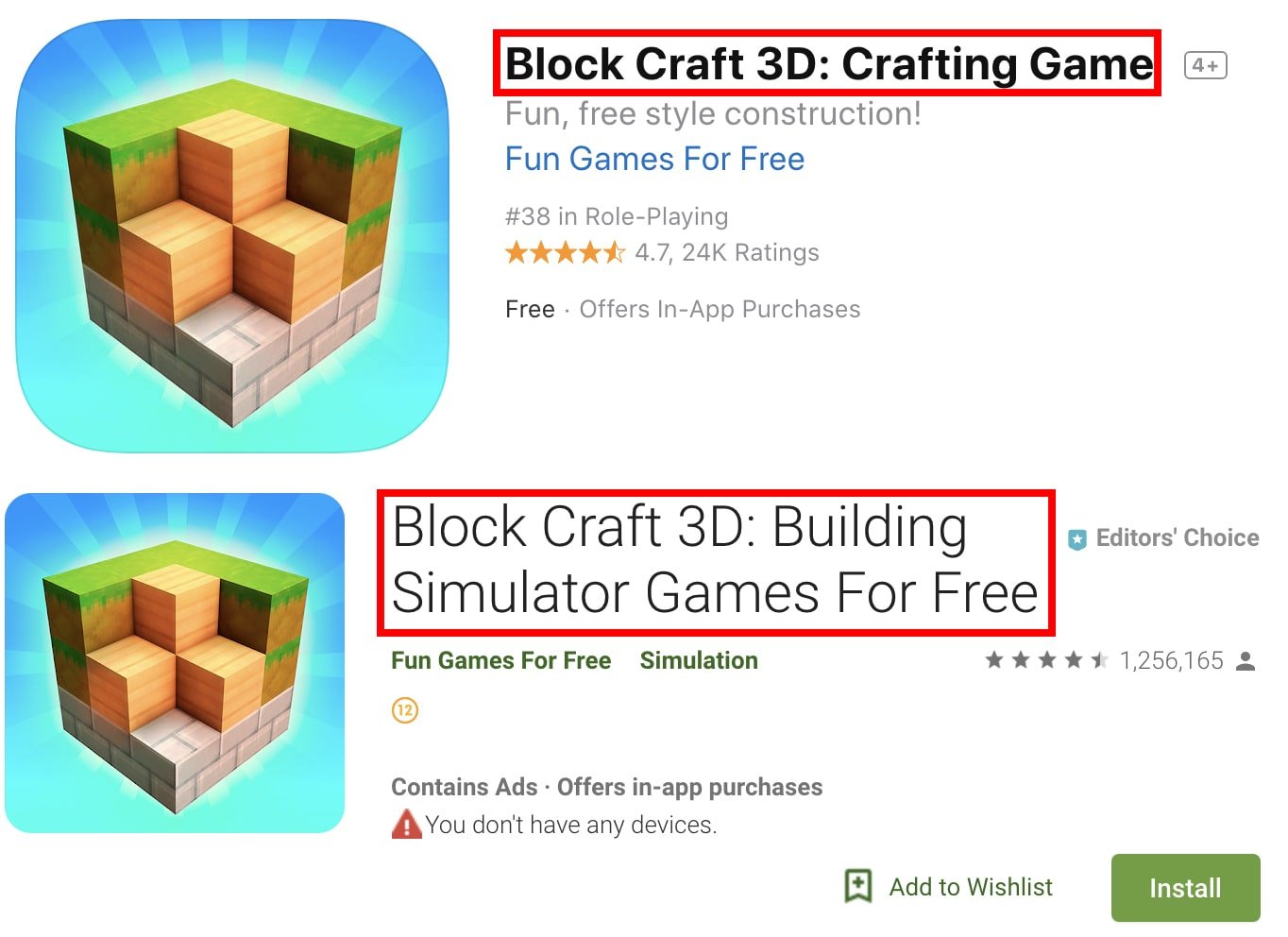
In both stores, App name is one of the most important factors since that field comprises main keywords.
In Apple App Store app name can be up to 30 characters long, in Google Play - up to 50 characters and usually developers use it to mention as many keywords as they can :)
Summary
